Project Overview
Duskline is a vinyl record shop that transforms into a listening bar at night. It's built for people who take music seriously but want somewhere warm and welcoming to enjoy it.
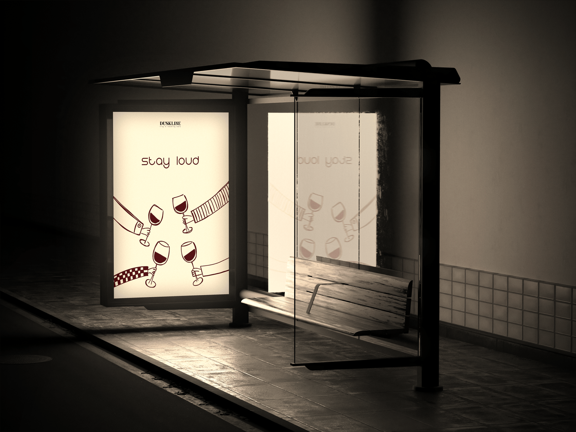
The brand identity captures that dual nature, dark, atmospheric, and confident by night, but always approachable. Every design decision was guided by one idea: sound first.

The Challenge
Duskline operates as two things at once, a record shop by day and a listening bar by night. The challenge was building a single brand identity that could hold both without feeling split or inconsistent.
The design had to feel warm and browsable in the daytime while shifting into something moodier and more atmospheric after dark. One visual language, two very different experiences.

Brand Strategy
The strategy was to lead with the listening experience rather than the products. Whether you are flipping through crates or sitting with a drink, the common thread is sound. That became the anchor for every brand decision.
From the color palette to the typography, everything was built to feel intentional and unhurried. The brand does not shout for attention. It draws you in quietly, the same way good music does.
Visual Identity
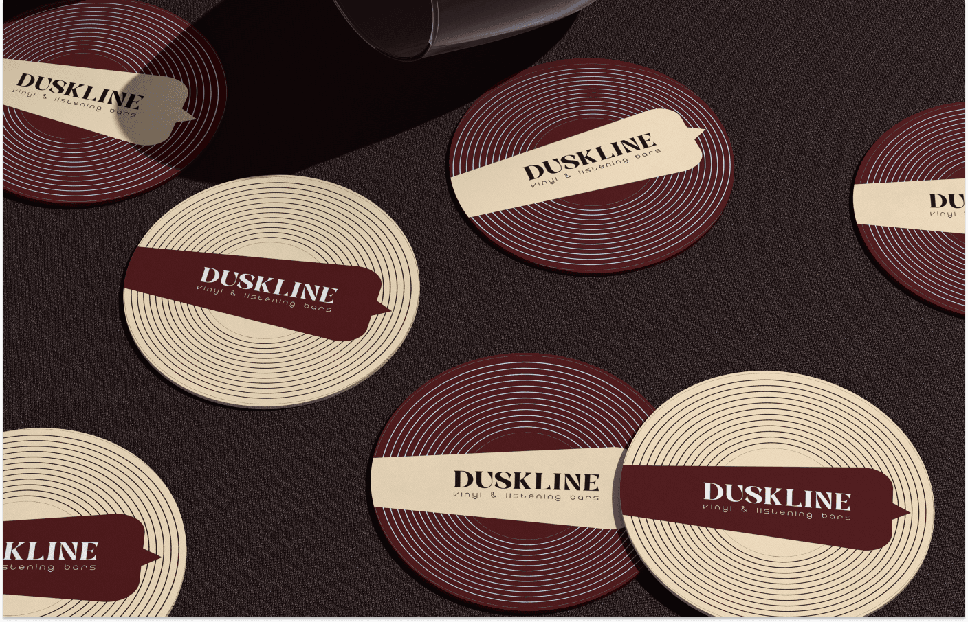
The identity is built around a rich, considered color system. Deep burgundy anchors the palette with weight and warmth, balanced by a soft cream and a warm off white that keep the brand from feeling heavy or closed off.
Together the three colors reflect the atmosphere of the space itself. Dark and intimate at its core, but always with enough warmth to feel welcoming. The palette works across everything from signage to packaging without losing its character.


Let's connect
I'm not just here to design products; I'm here to connect with people.
As a creative designer, I'm constantly exploring the space where creativity meets technology to build user experiences that are meaningful, lasting, and well crafted.